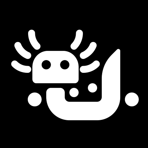
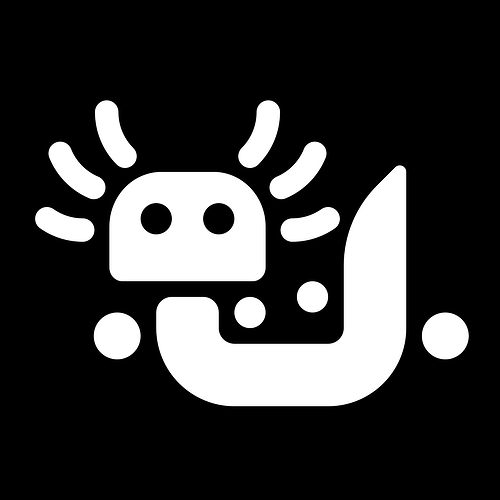
now this is the kind of proactive thinking we’re looking for
i really want to play around with something more vibrant and clean-looking overall.
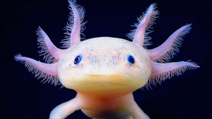
I think you’ll get there. I’ll be looking forward to seeing it. Might want to just make the tail an Aux cord (with the general pose of a curled-up-cat) and just make the head smooth/friendly
doing that on a grid is way easier said than done, and designing w/o a grid is not great for logos like this.
I’m still really loving the first iteration of the gills as jacks one!
Whatever we decide, can we try and get it into nerd-fonts? Would be super cool as my prompt when I install AuxOS
I tried oversimplifying that logo to fit 16x16 grid and be visible in small sizes, but it sacrifices all of detail as of now. Maybe we still can iterate on that idea for the logo, and get more friendly artwork as mascot artwork?
![]()
most logos, i usually size at 1024x1024 (or 1536x1536) and use a 32px (or 24px with a 1536px artboard) grid, if you’d like to play around with that. i find it has a good balance, and it lets me play around with boolean operations and cool circles.
working off @blue 's design:
Perhaps for the github and such, we could use a simple name picture for now, instead of the autogenerated one:
or
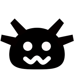
I like the head shape, it’s nice and soft. The strands on the side kind of make it look like a balding old man ![]()
I hate that you are right ![]()
Which do you like best? The upper or lowercase?
Upper, but that’s more in line with my original design idea. I thought maybe people would think the lowercase is friendlier.
I think I like the uppercase version as well
i was parsing them as just really big eyelashes tbh (it’s the beauty campaign after all)
This looks like something I’d see in Breath of the Wild ![]()
I love it. ![]()
This reminds me, it may be good to pick out a specific font to use whenever we write the name in text for consistency. Inkscape always uses Linux Libertine, for instance.
