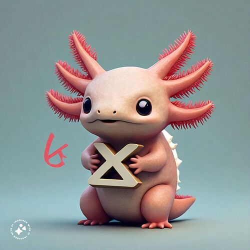
I’m trying to visualise more ideas, and llama apparently doesn’t understand what a “lambda” or a “2D drawing” is…
so long as the final product is not AI ![]()
Yeah I was about to say we may have to use an interim logo until we can pay an artist, or find someone who is willing to volunteer. I was just ideating, since I can’t draw lol
Agreed. Perhaps as a method of exploring some ideas quickly it can be useful, but our final asset should be human made with all the love and flaws that come with it.
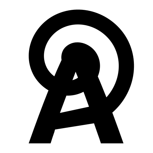
I attempted making a logo draft on “cable” idea, but it’s probably way too confusing.
Looks a lot more like ‘IUX’ than ‘aux’ imo. I can see both but uppercase vs lowercase is a little hard to tell
yeah, i don’t particularly like this version
I like the last one from @trespaul
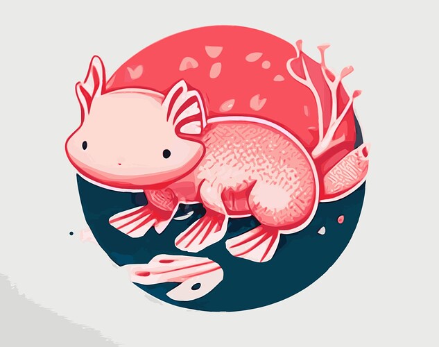
And here’s another starter one. Got some AI weirdness, but could be a good base color pallet
@jakehamilton I think we should throw one of these on the github org profile, because any of them are better than
I don’t think we need to rush. I’d rather Aux be known for getting things right even if it takes a few days rather than hastily throwing something at the wall.
I do like the colors in this one, very pleasing!
i’m loving what i see, but again it may be a good idea to go for legibility and recognizability here. we can do both of those and still have a super cute logo! even though it sounds weird, a lot of people do judge projects by their logos - people see skeumorphism and think old, they see a lot of complexity and think it’s a complex project, and they see a smile and think friendly!
the intersection of simple and friendly is where we want to be.
I do want to warn against using AI, I’m sure you’ve all heard the talking points already
honestly playing around in Inkscape is way more fun than using AI (imo) anyway, just make sure to put it on a grid and you’ll be going in no time.
I tried making something based on that (not really usable, and off-grid), and currently I got an idea of cable as tail.
Okay, in that case I think the Logo should be something that the steering committee should vote on. I was just thinking of throwing something up quick in the meantime. I’ll let the real artists handle this thread.
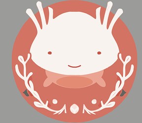
I kind of hope the icon will be something like this with better colors/proportions but mostly a face
i think the auxolotl logo may be getting a little too complex to use effectively at small sizes, i may try and improvise something tomorrow.
Definitely giving me big :3 vibes
i basically just went “fuck it i’m making it have an OwO face” at the last minute lol
