one suggestion, make sure to put the outlines behind the main drawing to preserve the grid layout. in inkscape it’s in the stroke paint settings.
ooooh I really like the contrast with the light blue background!!! Feels simultaneously calming and playful to me.
I like it!
I wonder about the more vibrant color on the little head bits coming out. Maybe a different color or even a gradient would do well there ![]()
Here’s with a gradient using the secondary color from the palette
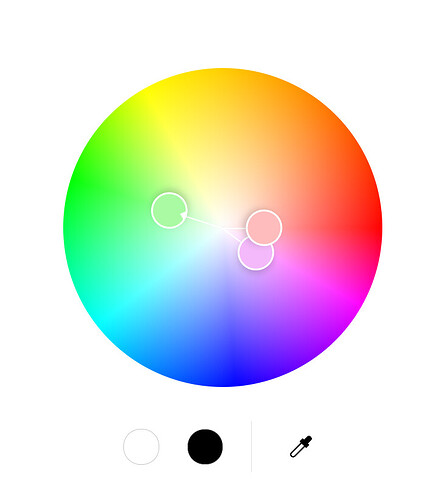
I think something closer to #F3B9FA is better for the fins than #F89DD8. Then we have a pleasing split complementary colour scheme, for clearly defined Primary, Secondary, and Accent colours (Realtime Colors). The green fits well with the sea theme.
Do you know the source of that picture please?
I’d like to reduce the outline thickness by 15% so the eyes and smile are a bit bigger relative to the line thickness (I think the “thin” one above would be like 70% reduction) but I might not have time. If you’d have the chance to do that @ jacab I’d appreciate it but I know this is last minute.
Edit: nvm I figured out a hack to do it quick!


