What about a water bubble to live in?
Okay, I’m going to be done messing with it for today, but where my head’s at currently is to get rid of the gradient, and if we ever want to display it with an extra pop of color, we can put it on top of the blue. I think it’s complementary and makes the auxolotl look like it’s swimming in water, but we might not always want a circle backdrop baked into the logo.
Also, let’s not forget that the logo still looks good even without ANY color, so it’s probably best not to overthink it.
Edit: I just realized I can make the images smaller so I don’t flood the page with giant images every time, sorry. ![]()
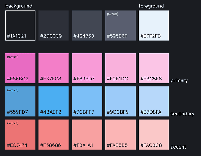
I took a jab at expanding the Dark variant from this post, and making some adjustments to try meet both WCAG 2.0 and APCA contrast requirements a little better - what do we think?
(anything marked “avoid” is a combination that doesn’t score very well for contrast - i should probably go back and adjust them)
I made sure to take WCAG and APCA standards into account when making the palette, so the intended color combinations score highly. We should definitely rename the colors and create a style guide to clarify the proper usage though, since the white text for example is not meant to be put over any of the primary/secondary/accent colors, but the “background” color can actually be used for that text, since it has very good contrast with those colors).
Will there be some kind of vote for color scheme once we settle on ideas? There is already a lot of them, and I am not 100% sure it would be appropriate to just take latest variant ones (though I do like them a lot)
